what killed innovation?
Find the discussion on Linkedin or Bluesky.
Mar 05, 2025
This is part of a trilogy on the state of our industry:
I entered the data visualization field in 2012, when D3.js had just come out and interactive graphics were going through a digital Renaissance. By the time I was fully steeped in the field in 2016, it felt like a new, experimental project was coming out every week—each one pushing the boundaries of how we think about, visualize, and communicate data.
New York Times' 512 Paths to the White House from 2012. When I think of the pre-scrollytelling era, it's always the first one I point to.
But fast forward a decade, and it feels like I’m seeing the same polished but predictable formats over and over.
At first, I thought I had gotten jaded (a decade in tech feels like forever and maybe I’m now just the old granny shaking my fist about the “good old days” 😂), but after talking to a few friends and mulling on it for a couple years, I now have some hypotheses on how we might have gotten here.
To test these hypotheses, I asked a few very respected voices in our industry—all known for their beautiful, bespoke work and responsible for driving the field forward in one way or another. So I’d like to thank everyone who kindly contributed: Nadieh Bremer, Giorgia Lupi, Federica Fragapane, Caitlin Ralph, Matt Daniels, RJ Andrews, Alberto Cairo, Eric William Lin, and Moritz Stefaner. While some of them are quoted directly, all of them provided insightful and nuanced answers that helped to shape my own whirlwind of ideas about where we are today, how we got here, and where we’re headed.
A brief history (of a plateau)
Let me come out swinging: our industry’s creativity has plateaued.
Ok, I don’t fully mean that (but it’s got a lot of potential for a click-bait title, no? 😂). Let me provide a bit more nuance: the craft of telling data-informed stories on the web has plateaued.
As Alberto recounts, newsrooms started digitizing in the mid-to-late 1990s, and by the time I started in the early 2010s, the foundations were laid out for really interesting web-based experiments. It was the perfect storm: Javascript was maturing, browser performance was improving, and D3.js was releasing interesting new layouts and supporting chart-specific interactions every year. I was constantly coming across new chart forms, and new ways to add interactions and animations to layer information. Just look at these two New York Times pieces from 2012 and 2013:
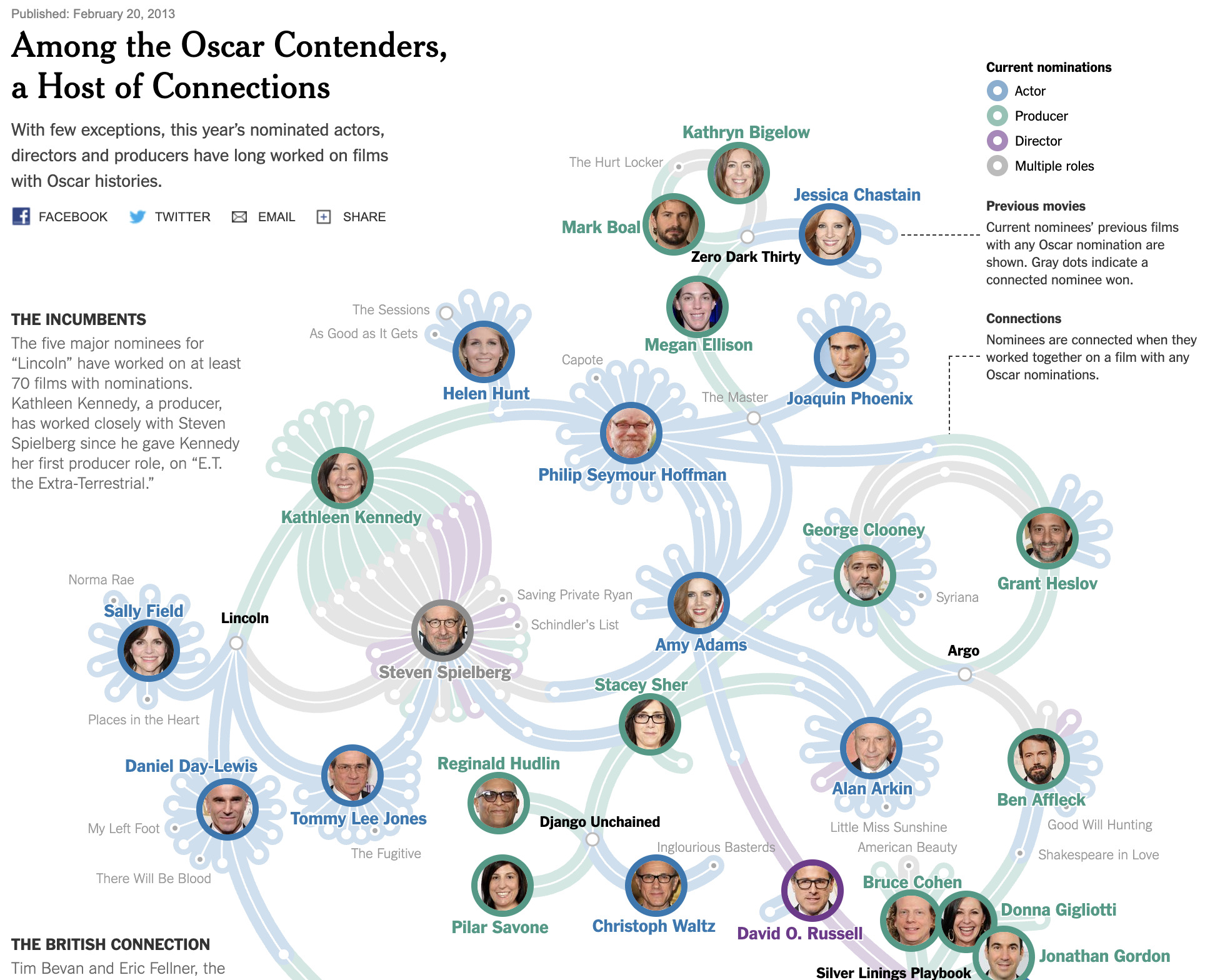
Four Ways to Slice Obama’s 2013 Budget Proposal (2012, left) and Among the Oscar Contenders, a Host of Connections (2013, right). From a technical perspective, I remember being so mind-blown about how the different budget items animated so smoothly between the different views, and so inspired by the use of force-directed graph to lay out the Oscar nominees (and that visual elegance!).
It really seemed like no two data visualizations looked the same.
RJ agrees that web interactives “hit some kind of romantic peak” in the mid-to-late 2010s. Nadieh dreamily recalls the advent of D3 visuals like chord diagrams and circle packing. “I can’t tell you what other mind boggling new technique or technology since then has, I’ve felt, made an impact,” she laments. “And that makes me very sad.”
Moritz summarizes his recent observations with the precision and insight of an industry veteran who has put out inspiration after inspiration for decades:
- The few viral, well-known data visualizations tend to be static images or movies or small, personalized apps rather than elaborate interactive web pieces.
- Visual styles are more homogenous, with many projects looking similar due to the prevalence of established formats, templated solutions and software defaults.
- On the commercial side, investments in bespoke data visualization from freelancers and independent studios have declined.
He declares: “it’s a polycrisis”.
But how did we get here (polycrisis)?
Over the past decade, I’ve noticed two fundamental shifts that have changed how we design interactive graphics on the web.
The first: scrollies.
I still remember when I first saw Stephanie Yee and Tony Chu’s “A visual introduction to machine learning” in 2016, I was blown away:
It felt so exciting that web performance had come so far, that browsers could continuously scroll and animate thousands of elements at the same time. Scrollytelling was so quickly adopted that there was even a big debate about whether scrollies or steppers were “better” (beautifully summarized in this blog post by Zan Armstrong). But the scrolly won out as more and more readers consumed data visualizations through mobile screens, where scrolling was the native behavior.
Newsrooms brought scrollytelling to the masses, but the format almost worked too well. Many newsrooms began to treat it as the default storytelling method and, due to its success, had less reason to test other formats. Eric, who has direct newsroom experience, says that “data journalists found the forms that best fit their needs, and their audiences’. It’s not that there’s no more experimentation within graphics and data desks in newsrooms, but they’ve become more isolated and case-by-case rather than the general cultural norm. Repeatability and efficiency are now more important.”
I used to look forward to the Information is Beautiful Awards every year for inspiration. But I distinctly remember the 2022 Awards, when I went through the shortlist and was inundated by scrollytelling pieces. It’s not that they weren’t good, but that after a while I couldn’t distinguish one from the next.
That was the year I realized I was experiencing scrollytelling fatigue™️.
I noticed the second shift during the Covid-19 pandemic. We saw charts about cases, and hospitalizations, and deaths, and vaccination rates…they were everywhere we looked online.
At the time, I thought that data literacy might improve on a massive scale. A public that recognized the importance of data, that recognized the need to interpret charts, could perhaps also recognize that some data stories are just too complex and nuanced to be aggregated in bar charts and line charts. Surely, they’d be curious about more complex visualizations.
I could dream.
Instead, though there was indeed an increase in public awareness of charts, the majority of people—as I wrote in my previous blog post—were only interested in those standard charts. I’ve found in recent years that my clients have started to shy away from anything too unconventional because they’re concerned about getting pushback from their stakeholders and readers. Giorgia puts it best: “Some information will always be best conveyed in a straightforward bar or line chart, particularly for audiences that don’t have time to engage deeply. And as data literacy expanded—especially post-pandemic—the demand for intuitive, quick-to-grasp visuals naturally increased.”
Why, though?
In both of those shifts, there is a common refrain: the demand for easier, quicker, more bite-sized content.
It’s underpinned by a cultural shift towards mobile phones as our primary mode of content consumption. The shift, as RJ notes, has shrunk the canvas, trained audiences to engage in short bursts, and has generally “made the Internet a not-fun place to hang out.” Matt of The Pudding echoes this observation: Audiences want more video and images that can fit on Instagram, “which means it can’t carry too much detail on mobile phone screens.”
Audiences are also just less easily impressed these days: “The idea of visualizing data for artistic ‘wow-ness’ is far less novel than it used to be,” Matt says. “The idea of visualizing big data is not as new anymore, and in many ways expected and benign. Data viz as art just doesn’t hit the same way that it used to.”
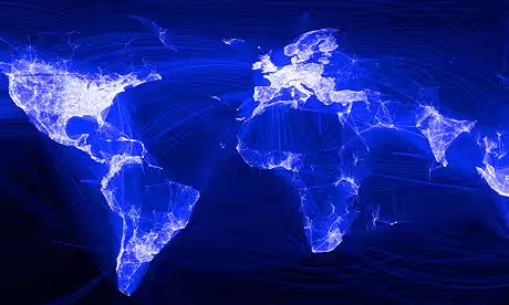
Matt shared this map of Facebook friendships, created by Paul Butler in 2010, that “broke the internet”. He’s seeing similar maps since, but “it just doesn’t turn heads like it used to”. There’s a really interesting tangent there that I want to explore one day, about the connection between novelty, a technical difficulty (“a good challenge”), and the motivation to experiment.
He has a point. All the New York Times graphics I shared earlier were ground-breaking when they first came out, but if I saw them now, I probably wouldn’t bat an eye. (Except the Oscars piece, that one still gets me.) The bar has been set.
Which leads to an interesting conundrum: The most successful charts and formats get rolled up into chart-building tools and templatized. On one hand, this is a great thing—we all benefit from easier and more accessible ways of creating. But, as Moritz notes, it also leads to less investment in truly original data visuals and an overabundance of more homogenous visual styles. And that’s how we end up with scrollytelling fatigue™️ and our clients and their stakeholders asking for bar charts and line charts.
Speaking of clients, Moritz notes that in economic downturns like the one we’ve been in, everybody tends to play it safe: “In an uncertain economy, clients—especially startups, nonprofits, or mid-sized firms—may cut creative budgets or prioritize ‘good enough’ solutions over innovative, artisanal visualizations.” Bespoke interactive graphics are often big and expensive to build, and their impact might be hard to measure. On the other hand, those same no-code or low-code chart-building tools have become increasingly impressive and easier for clients to maintain. These days, he says, “there are many more ways to create good-enough dynamic charts and charts… with little or no coding effort, with the additional benefit of integrating directly into existing information ecosystems.”
Zooming out
Giorgia contextualizes what we’re experiencing as the natural ebb and flow of an innovation cycle: “I think every wave of technological or methodological change follows a predictable pattern: an initial hype cycle, a period of widespread adoption, and then an eventual plateau where only the most practical elements endure.”
We’re currently smack in the middle of that plateau, but, as Alberto reminds me, that’s not a bad thing. “Sometimes we have periods of very rapid development and innovation, like a new technology shows up, a new programming language, a new technique, and there’s very quick adoption of that, a lot of experimentation, a lot of excitement. And suddenly we reach a plateau in which that new technology feels a little bit dated or overused,” he says. “Sometimes there are periods in which we withdraw a little bit from that innovation and we go back to traditional forms. But then there will be another period of innovation. Somebody will come up with a novel way of doing things, and there will be another period of excitement. So maybe the period that we are in right now is a time of regrouping. But that’s not necessarily a bad thing.”
After all, he was part of a very small group of newspapers pushing for interactive graphics in the late 90’s, when journalists and designers were getting pushback from their editors for scatterplots and histograms. He’s lived through an innovation cycle already, and he’s unfazed.
So what next?
As an experimenter that thrives off of novelty, I’ve been restless for our next cycle of innovation—and I have thoughts. Lots of thoughts, actually, especially after hearing from so many amazing perspectives.
So don’t forget to like, subscribe, and hit that notification bell!
(Sorry I’ve always wanted to pretend I’m an Youtuber 😂)
(But if you do want to subscribe, the next one should be a really good one 🎊)